The MOLIM platform: credit data that makes sense at a glance
AZM X redesigned MOLIM's experience across app and web, so users can read their credit record easily and subscribe without leaving the flow.
The problem
MOLIM gives users a single platform to view and act on their credit data, and it is the main point of contact that helps them with their finances. Therefore, the challenge was for every number on the screen to make sense the first time it is read, however complex the systems and data behind it.
The challenge
MOLIM relies on highly complex backend systems and data, while users need to understand their credit standing instantly and accurately. So our work centred on 4 key questions.

01
Needs
What financial data do users need to see instantly?
02
Challenges
Where does the user journey stall in the previous app?
03
Experience
How do we make heavy backend data look simple on the screen?
04
Improvements
What changes will naturally drive more subscriptions?
The objectives
5 objectives for a smoother user experience
The approach
Designed with the people who use it
Discovery drew on 7 research methods and 36 participants: 22 MOLIM staff and 14 external users.
Stakeholder interviews
Regular meetings with department heads to capture business rules and constraints.
Expert evaluation
The old platform scored against 10 global usability heuristics.
Persona development
5 user profiles grounded in real financial habits and goals.
Usability testing
The designs tested with 10 real users across 4 different work sectors.
The solution
One look is enough
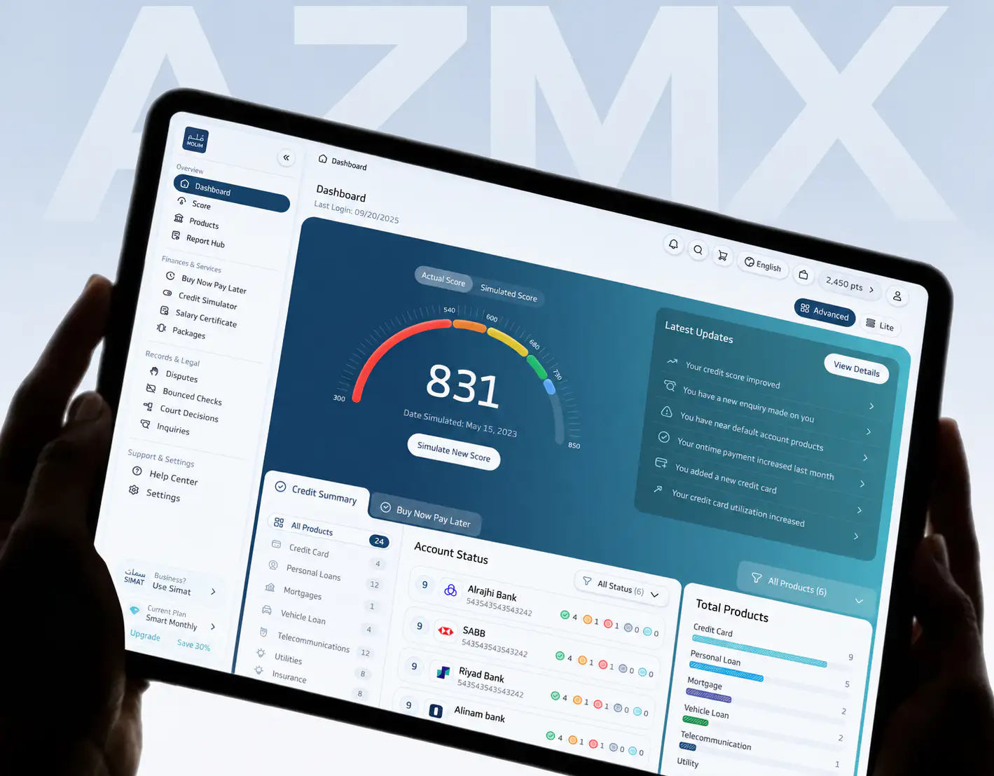
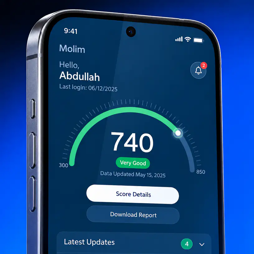
The first thing a user needs to see is where they stand, so the credit score leads the home screen, with a word that explains it and the date the data was last updated.
The detail is one step away, with one button for the score breakdown and another to download the report. On a tablet the screen holds the full picture: the score sits next to the latest updates and the status of each bank account.

Delivery and impact
Three stages of the work, stacking as you scroll, just as the project's layers do.
05
From discovery to strategy
Discovery surfaced 42 core challenges, 30 UX pain points and 15 brand gaps. The strategy turned them into 2 service blueprints, 1 value proposition and 16 core KPIs.
06
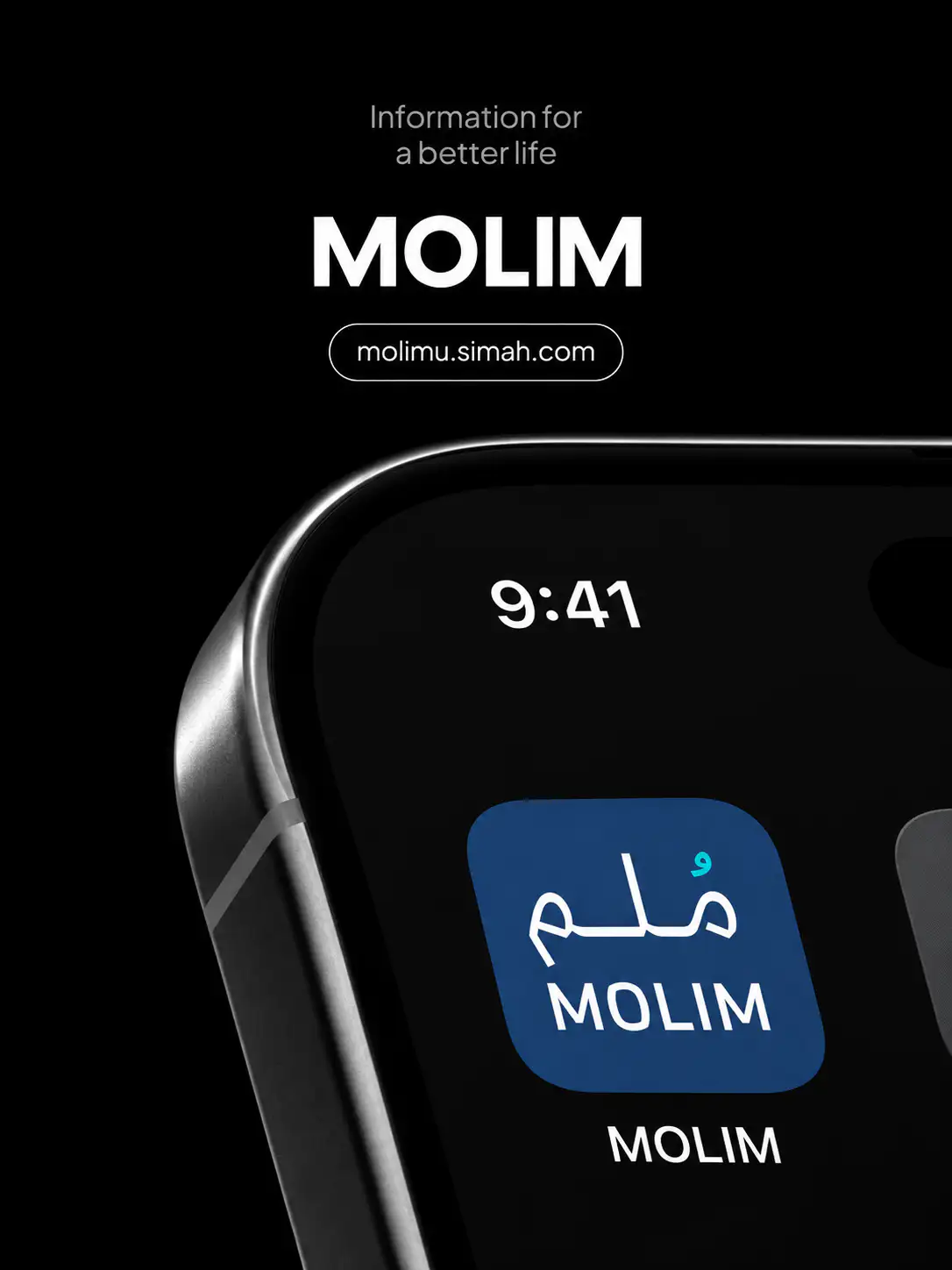
App and web, screen by screen
The project delivered 3,087 screens: 1,242 for the native app, 1,049 for desktop web and 796 for mobile web, together with a complete design system in Figma.
07
Validated with users
In testing with real users, the new MOLIM design scored 82% on the System Usability Scale and 6.1 out of 7 for ease of completing a task.
System Usability Scale score

The MOLIM redesign represents a major step toward a flawless digital experience. By balancing business requirements with real user needs, we transformed complex credit data into a clear, empowering journey and significantly lowered the risk for the development phase.
Handover
Everything the development team needs
We delivered a complete design package to MOLIM's development team: the final screens, the unified design system and the service blueprints, backed by strategy reports and the five user personas.
MOLIM is now strategically placed to strengthen its credibility and drive subscription growth.